
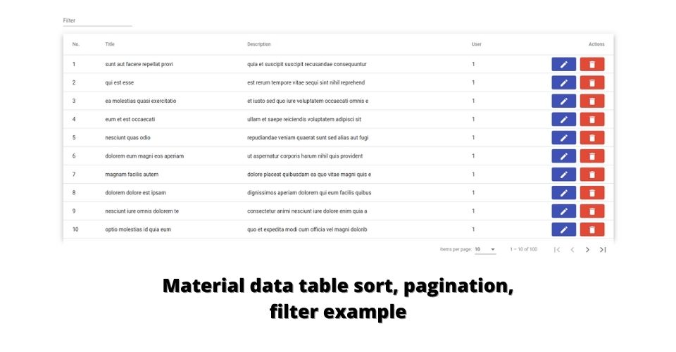
In this post, I will implement a material data table with API call and also show material table sort, pagination, filter feature.
Start a new project from scratch
ng new angular-mat-table
cd angular-mat-table
Add angular material dependancy
ng add @angular/material
Import material modules
In the app.module.ts file add modules.
import { NgModule } from '@angular/core';
import { BrowserModule } from '@angular/platform-browser';

import { AppRoutingModule } from './app-routing.module';
import { AppComponent } from './app.component';
import { BrowserAnimationsModule } from '@angular/platform-browser/animations';
import { HttpClientModule } from '@angular/common/http';

import { MatTableModule } from '@angular/material/table';
import { MatPaginatorModule } from '@angular/material/paginator';
import { MatInputModule } from '@angular/material/input';
import { MatSortModule } from '@angular/material/sort';
import { MatButtonModule } from '@angular/material/button';
import { MatIconModule } from '@angular/material/icon';

@NgModule({
  declarations: [
    AppComponent
  ],
  imports: [
    BrowserModule,
    AppRoutingModule,
    BrowserAnimationsModule,
    HttpClientModule,
    MatTableModule,
    MatInputModule,
    MatPaginatorModule,
    MatSortModule,
    MatButtonModule,
    MatIconModule
  ],
  providers: [],
  bootstrap: [AppComponent]
})
export class AppModule { }
MatTableModule: MatTableModule is the core module for the material table. MatTabTable module container all table directives. Some examples: mat-table, MatCellDef, MatHeaderCellDef
MatSortModule: MatSortModule allows matTable header sortable. this is also an optional module.
MatPaginatorModule: MatPaginationModile is generic module of material. It uses for paginate data and this module helps to paginate the material table data.
MatInputModule: I am going to show the material table data filter example, which needs input so I will use the material input field. It’s an optional module for table
HttpClientModule: httpClintModule is an angular generic module which use for API calls.
RestOfModules import: MatButtonModule, MatIconModule, MatProgressSpinnerModule is also a generic module that can be used for the material button, icon, and loader
Fetch table data and prepare for material table
In app.componenet.ts file. prepare material table data
import { HttpClient } from '@angular/common/http';
import { Component, OnInit } from '@angular/core';
import { MatTableDataSource } from '@angular/material/table';
export interface Post {
id: number;
title: string;
body: string;
userId: number;
}
@Component({
selector: 'app-root',
templateUrl: './app.component.html',
styleUrls: ['./app.component.scss']
})
export class AppComponent implements OnInit {
displayedColumns: string[] = ['id', 'title', 'body', 'userId', 'actions'];
dataSource = new MatTableDataSource<Post>([]);
constructor(private http: HttpClient) { }
ngOnInit(): void {
this.fetchPosts()
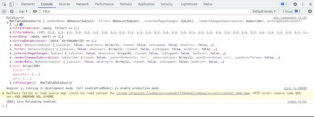
console.log('DataSource', this.dataSource)
}
fetchPosts(): void {
this.http.get('https://jsonplaceholder.typicode.com/posts').subscribe((data) => {
this.dataSource.data = data as Post[];
})
}
}
Explanation
Interface: First of all declare post interface
MatTableDataSource: We are going to use a build-in matTableDataSource table data source.
displayed columns: display columns material table columns identity.
Datasource: Initial empty list of the data sources.
FetchPosts: “fetchPosts” methods fetch all post data from API. and insert dataSource. call fechPosts method in OnInit component circle which it will call before component view
Note: this is not a good way to call API in the component. best way to call API from particular service.
let’s what is is in-side build-in MatTableDataSource.
To start server: ng serve
Let’s implement material table in HTML
This data table list of posts that has five columns (id, title, description, userId, action buttons)
Edit app.component.html file
<div class="container">
  <table mat-table [dataSource]="dataSource" class="mat-elevation-z8">
    <!-- Id Column -->
    <ng-container matColumnDef="id">
      <th mat-header-cell *matHeaderCellDef> No. </th>
      <td mat-cell *matCellDef="let element"> {{element.id}} </td>
    </ng-container>
    <!-- <mat-text-column name="id"></mat-text-column> -->

    <!-- Title Column -->
    <ng-container matColumnDef="title">
      <th mat-header-cell *matHeaderCellDef> Title </th>
      <td mat-cell *matCellDef="let element"> {{element.title | slice: 0:30}} </td>
    </ng-container>

    <!-- Body Column -->
    <ng-container matColumnDef="body">
      <th mat-header-cell *matHeaderCellDef> Description </th>
      <td mat-cell *matCellDef="let element"> {{element.body | slice: 0:50}} </td>
    </ng-container>

    <!-- UserId Column -->
    <ng-container matColumnDef="userId">
      <th mat-header-cell *matHeaderCellDef> User </th>
      <td mat-cell *matCellDef="let element"> {{element.userId}} </td>
    </ng-container>
    <!-- Actions Column -->
    <ng-container matColumnDef="actions">
      <th mat-header-cell *matHeaderCellDef style="text-align: right;"> Actions </th>
      <td mat-cell *matCellDef="let element">
        <div style="display: flex;align-items: center;justify-content: flex-end;">
          <button mat-flat-button color="primary" style="margin-right: 10px;"><mat-icon>edit</mat-icon></button>
          <button mat-flat-button color="warn"><mat-icon>delete</mat-icon></button>
        </div>
      </td>
    </ng-container>

    <tr mat-header-row *matHeaderRowDef="displayedColumns, sticky: true"></tr>
    <tr mat-row *matRowDef="let row; columns: displayedColumns;"></tr>
  </table>
</div>
Fix table and container size
By default table tag has no widh limit. without widh table data is collapsed each columns. So add table size
Container is fully optional. I was implement container to display table center
In the app.component.scss file.
.container {
  padding: 50px 20px;
  width: 100%;
  max-width: 1440px;
  margin: 0 auto;
}

table {
  width: 100%;
}
Explain material table column
    <!-- Title Column -->
    <ng-container matColumnDef="title">
      <th mat-header-cell *matHeaderCellDef mat-sort-header> Title </th>
      <td mat-cell *matCellDef="let element"> {{element.title | slice: 0:30}} </td>
    </ng-container>
We can see each column defined with which has the matColumnDef directive and unique columns identifier as columns name. If any column display only just plain text you can use mat-text-column element with name attribute. but name an attribute must be a unique identifier as column name
Each column should contain a table header with mat-header-cell directive and row cell with mat-cell and *matCellDef directive.
Explain material row template
    <tr mat-header-row *matHeaderRowDef="displayedColumns, sticky: true"></tr>
    <tr mat-row *matRowDef="let row; columns: displayedColumns;"></tr>
So when defined material columns to render header and data row, we need to define rows header and data row.
Implement material table pagination
Material table MatTableDataSource provide build-in pagination. it need to attach pagination with table.
After table, add material pagination in app.component.html file.
<div class="container">
  <table mat-table [dataSource]="dataSource" class="mat-elevation-z8">

  </table>
  <mat-paginator [pageSizeOptions]="[10, 25, 50, 100]" showFirstLastButtons></mat-paginator>
</div>
Attach pagination with material MatTableDataSource. Modify app.component.ts file
// ...
import { MatPaginator } from '@angular/material/paginator';

@Component({
  selector: 'app-root',
  templateUrl: './app.component.html',
  styleUrls: ['./app.component.scss']
})
export class AppComponent implements OnInit {
  // ...
  @ViewChild(MatPaginator, {static: true}) paginator!: MatPaginator;
  constructor(private http: HttpClient) { }
  ngOnInit(): void {
    this.dataSource.paginator = this.paginator;
    // ...
  }
  // ...
}
Implement material table sort
Attach sort with Material MatTableDataSource, modify the app.component.ts file
// ...
import { MatPaginator } from '@angular/material/paginator';
import { MatSort } from '@angular/material/sort'

@Component({
  selector: 'app-root',
  templateUrl: './app.component.html',
  styleUrls: ['./app.component.scss']
})
export class AppComponent implements OnInit {
  // ...
  @ViewChild(MatPaginator, {static: true}) paginator!: MatPaginator;
  @ViewChild(MatSort, { static: true }) sort!: MatSort;
  constructor(private http: HttpClient) { }
  ngOnInit(): void {
    this.dataSource.paginator = this.paginator;
    this.dataSource.sort = this.sort;
    // ...
  }
  // ...
}
Modify app.component.html file
In my case, I was used MatTableDataSource. So It needs to define the matSort directive in the table. And we need to add mat-header-sort directive in header columns cell
<div class="container">
  <table mat-table [dataSource]="dataSource" class="mat-elevation-z8" matSort>
    <!-- Id Column -->
    <ng-container matColumnDef="id">
      <th mat-header-cell *matHeaderCellDef mat-sort-header> No. </th>
      <td mat-cell *matCellDef="let element"> {{element.id}} </td>
    </ng-container>

    <!-- Title Column -->
    <ng-container matColumnDef="title">
      <th mat-header-cell *matHeaderCellDef mat-sort-header> Title </th>
      <td mat-cell *matCellDef="let element"> {{element.title | slice: 0:30}} </td>
    </ng-container>
  </table>
</div>
Implement material table filter
Material table filter uses a generic strategy. when the user types input and MatTableDataSource filter property listen to the input value which is filter data in dataSource
Implement listener MatTableDataSource filter
Modify app.component.ts file. Define applyFilter method to filter dataSource data
// ...

@Component({
  selector: 'app-root',
  templateUrl: './app.component.html',
  styleUrls: ['./app.component.scss']
})
export class AppComponent implements OnInit {
  // ...
  fetchPosts(): void {
    this.http.get('https://jsonplaceholder.typicode.com/posts').subscribe((data) => {
      this.dataSource.data = data as Post[];
    })
  }
  applyFilter(event: Event) {
    const filterValue = (event.target as HTMLInputElement).value;
    this.dataSource.filter = filterValue.trim().toLowerCase();

    if (this.dataSource.paginator) {
      this.dataSource.paginator.firstPage();
    }
  }
}
Implement filter input field
Modify app.component.ts file.
Note: For example use the matInput field. so make sure you import MatInputModule from material
<div class="container">
  <mat-form-field appearance="standard">
    <mat-label>Filter</mat-label>
    <input matInput (keyup)="applyFilter($event)" placeholder="Ex. esse" #input>
  </mat-form-field>
  <table mat-table [dataSource]="dataSource" class="mat-elevation-z8" matSort>
  </table>
</div>
Checkout example code in GitHub: https://github.com/techincent/angular-material-table