
Bootstrap is the most popular front-end toolkit framework. It features a responsive grid system, extensive prebuilt components that help developers quickly design and customize responsive mobile views.
In this tutorial, I am going to integrate bootstrap into an angular application. let’s begun …
Start with New Angular Applicaition
I am going to generate a new angular application for this tutorial. KIf you have already an angular application you can avoid this step.
Make sure you always create angular applications with the angular latest version. So I always do when I created a new application
npm uninstall -g @angular/cli
npm install -g @angular/cli
Generate new project
ng new bootstrapify
? Would you like to add Angular routing? Yes
? Which stylesheet format would you like to use? SCSS

cd bootstrapfy
I always use angular scss, I love it. but you can use your own favorite CSS methodology
Install Bootstrap 5 In This Project
npm i bootstrap
Configrations bootstrap
Add bootstrap css file
Two ways we can add bootstrap CSS
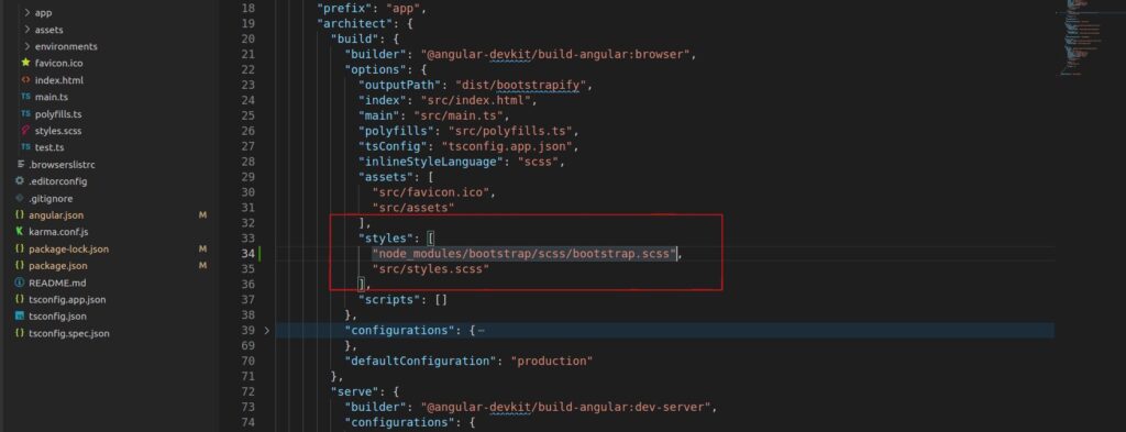
Method #1. Link bootstrap css to angular.json file ( Preferred and used in this project )
Add “node_modules/bootstrap/scss/bootstrap.scss” or “node_modules/bootstrap/dist/css/bootstrap.min.css” file in angular.son build styles section.
Note: Make sure you add the above styles.scss
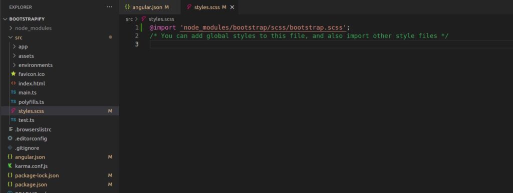
Method #2. Link bootstrap css to src/styles.scss file ( skipped for this project)
import “node_modules/bootstrap/scss/bootstrap.scss” or “node_modules/bootstrap/dist/css/bootstrap.min.css” file above in styles.scss
Add bootstrap js file
Before I add the bootstrap js file we need to know what role popper.js file is in bootstrap? Popper.js is responsible for tooltips and popovers, some of the bootstrap Javascript functions required popper.js.
Bootstrap provides Javascript and propper.js library as precompiling bootstrap.bundle.js and bootstrap.bundle.min.js files. learn more about bootstrap precompile files
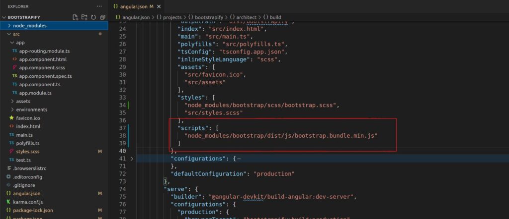
So Add bootstrap bundle file which popper.js included ( skipped for this project)
Add “node_modules/bootstrap/dist/js/bootstrap.bundle.min.js” file in angular.json file in the scripts section
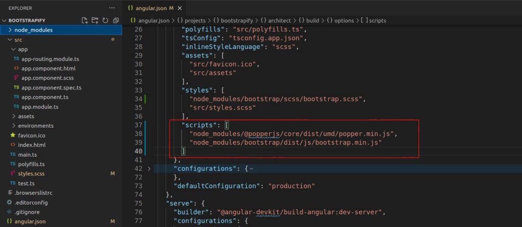
Add bootstrap js and popper.js separatly (Used for this project)
Default popper.js is not installed in this project. So add popper.js package
npm i @popperjs/core
After install popper.js. “node_modules/@popperjs/core/dist/umd/popper.min.js” and “node_modules/bootstrap/dist/js/bootstrap.min.js” add-in srcipts item
Note: Make sure popper.js file must top of the bootstrap js file.
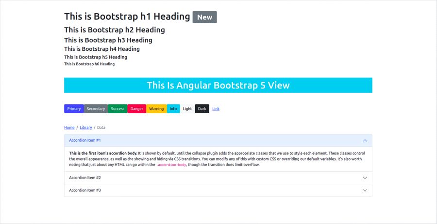
Let’s see bootstrap view
Edit app.component.html file.
<section class="py-5">
  <div class="container">
    <h1>This is Bootstrap h1 Heading <span class="badge bg-secondary">New</span></h1>
    <h2>This is Bootstrap h2 Heading</h2>
    <h3>This is Bootstrap h3 Heading</h3>
    <h4>This is Bootstrap h4 Heading</h4>
    <h5>This is Bootstrap h5 Heading</h5>
    <h6>This is Bootstrap h6 Heading</h6>
    <h1 class="mt-5 bg-info text-center text-white py-2">This Is Angular Bootstrap 5 View</h1>
    <div class="mt-5">
      <button type="button" class="btn btn-primary">Primary</button>
      <button type="button" class="btn btn-secondary">Secondary</button>
      <button type="button" class="btn btn-success">Success</button>
      <button type="button" class="btn btn-danger">Danger</button>
      <button type="button" class="btn btn-warning">Warning</button>
      <button type="button" class="btn btn-info">Info</button>
      <button type="button" class="btn btn-light">Light</button>
      <button type="button" class="btn btn-dark">Dark</button>
      <button type="button" class="btn btn-link">Link</button>
    </div>
    <nav class="mt-5" aria-label="breadcrumb">
      <ol class="breadcrumb">
        <li class="breadcrumb-item"><a href="#">Home</a></li>
        <li class="breadcrumb-item"><a href="#">Library</a></li>
        <li class="breadcrumb-item active" aria-current="page">Data</li>
      </ol>
    </nav>
    <div class="accordion" id="accordionExample">
      <div class="accordion-item">
        <h2 class="accordion-header" id="headingOne">
          <button class="accordion-button" type="button" data-bs-toggle="collapse" data-bs-target="#collapseOne" aria-expanded="true" aria-controls="collapseOne">
            Accordion Item #1
          </button>
        </h2>
        <div id="collapseOne" class="accordion-collapse collapse show" aria-labelledby="headingOne" data-bs-parent="#accordionExample">
          <div class="accordion-body">
            <strong>This is the first item's accordion body.</strong> It is shown by default, until the collapse plugin adds the appropriate classes that we use to style each element. These classes control the overall appearance, as well as the showing and hiding via CSS transitions. You can modify any of this with custom CSS or overriding our default variables. It's also worth noting that just about any HTML can go within the <code>.accordion-body</code>, though the transition does limit overflow.
          </div>
        </div>
      </div>
      <div class="accordion-item">
        <h2 class="accordion-header" id="headingTwo">
          <button class="accordion-button collapsed" type="button" data-bs-toggle="collapse" data-bs-target="#collapseTwo" aria-expanded="false" aria-controls="collapseTwo">
            Accordion Item #2
          </button>
        </h2>
        <div id="collapseTwo" class="accordion-collapse collapse" aria-labelledby="headingTwo" data-bs-parent="#accordionExample">
          <div class="accordion-body">
            <strong>This is the second item's accordion body.</strong> It is hidden by default, until the collapse plugin adds the appropriate classes that we use to style each element. These classes control the overall appearance, as well as the showing and hiding via CSS transitions. You can modify any of this with custom CSS or overriding our default variables. It's also worth noting that just about any HTML can go within the <code>.accordion-body</code>, though the transition does limit overflow.
          </div>
        </div>
      </div>
      <div class="accordion-item">
        <h2 class="accordion-header" id="headingThree">
          <button class="accordion-button collapsed" type="button" data-bs-toggle="collapse" data-bs-target="#collapseThree" aria-expanded="false" aria-controls="collapseThree">
            Accordion Item #3
          </button>
        </h2>
        <div id="collapseThree" class="accordion-collapse collapse" aria-labelledby="headingThree" data-bs-parent="#accordionExample">
          <div class="accordion-body">
            <strong>This is the third item's accordion body.</strong> It is hidden by default, until the collapse plugin adds the appropriate classes that we use to style each element. These classes control the overall appearance, as well as the showing and hiding via CSS transitions. You can modify any of this with custom CSS or overriding our default variables. It's also worth noting that just about any HTML can go within the <code>.accordion-body</code>, though the transition does limit overflow.
          </div>
        </div>
      </div>
    </div>
  </div>
</section>
Bootstrap 5 is not required jquery dependency
If you use bootstrap above 5 versions. you required query dependency, check out How to add query in angular