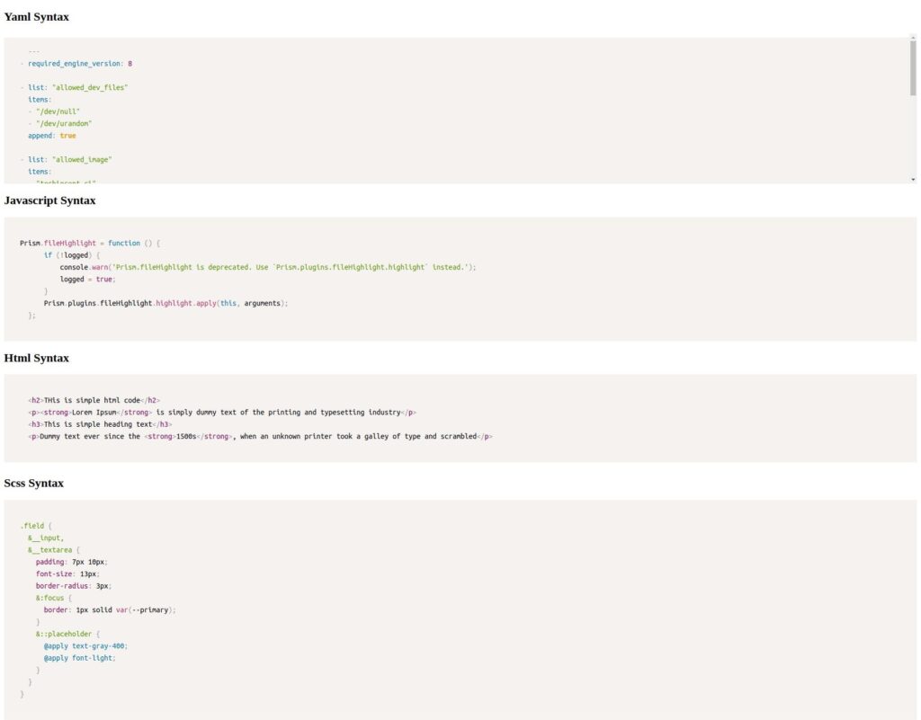
Hello guys, Recently I implemented a reused able prism.js code syntax highlighter component for my project, I researched it on the internet. and there is some code highlighter for angular. and I saw most of them were not capable of the angular latest version. So I decided to use prism.js without any angular base third-party library.
I always try to use as custom maintainable code to avoid third party library
Generate angular project all simple-app
ng new simple-app
Generate SharedModule and configurations
I am going to use the SharedModule convention for this example to show you a resued able prismjs highlighter component. If you don’t know about the SharedModule convention, learn more about SharedModule Component
Go to the project directory in my case “simple-app”,
sajal@sajal-HP-ProBook-450-G8-Notebook-PC:~/programming/techincent/simple-app$ ng g m shared
CREATE src/app/shared/shared.module.ts
Import SharedModule in the app.component.ts file
import { NgModule } from '@angular/core';
import { BrowserModule } from '@angular/platform-browser';

import { AppRoutingModule } from './app-routing.module';
import { AppComponent } from './app.component';
import { SharedModule } from './shared/shared.module';

@NgModule({
  declarations: [
    AppComponent
  ],
  imports: [
    BrowserModule,
    AppRoutingModule,
    SharedModule
  ],
  providers: [],
  bootstrap: [AppComponent]
})
export class AppModule { }
Install And Configuration Prismjs
Install prismjs package with the following terminal command
npm install prismjs --save
Import Prismjs components
Prismjs provide a lot of syntax components, so it’s the best to use to import your needed components of prismjs. in this example, I am going to use YAML, HTML, SCSS, JAVASCRIPT components
import { NgModule } from '@angular/core';
import { CommonModule } from '@angular/common';
import { PrismComponent } from './components/prism/prism.component';

import 'prismjs/components/prism-javascript';
import 'prismjs/components/prism-yaml';
import 'prismjs/components/prism-scss';
// Add more prism language if need!

@NgModule({
  declarations: [],
  imports: [
    CommonModule
  ],
  exports: []
})
export class SharedModule { }
Import prismjs theme CSS file
Go to src/styles.scss file and import prism.css as the default theme file. I am going to use the default prism theme. The available theme link is also provided below, check the prism theme example.
/* Prismjs theme */
@import "prismjs/themes/prism.css";
/* Available themes */
// @import "prismjs/themes/prism-coy.css";
// @import "prismjs/themes/prism-dark.css";
// @import "prismjs/themes/prism-funky.css";
// @import "prismjs/themes/prism-okaidia.css";
// @import "prismjs/themes/prism-solarizedlight.css";
// @import "prismjs/themes/prism-tomorrow.css";
// @import "prismjs/themes/prism-twilight.css";

/* You can add global styles to this file, and also import other style files */
Generate reusable Prism Component
ng g c shared/components/prism --export
Export your prism component via “–export” tag, which means it will be able to use in other components.
Take a look at your Folder structure of this project
.
├── angular.json
├── karma.conf.js
├── package.json
├── package-lock.json
├── README.md
├── src
│   ├── app
│   │   ├── app.component.html
│   │   ├── app.component.scss
│   │   ├── app.component.spec.ts
│   │   ├── app.component.ts
│   │   ├── app.module.ts
│   │   ├── app-routing.module.ts
│   │   └── shared
│   │       ├── components
│   │       │   └── prism
│   │       │       ├── prism.component.html
│   │       │       ├── prism.component.scss
│   │       │       ├── prism.component.spec.ts
│   │       │       └── prism.component.ts
│   │       └── shared.module.ts
│   ├── assets
│   ├── environments
│   │   ├── environment.prod.ts
│   │   └── environment.ts
│   ├── favicon.ico
│   ├── index.html
│   ├── main.ts
│   ├── polyfills.ts
│   ├── styles.scss
│   └── test.ts
├── tsconfig.app.json
├── tsconfig.json
└── tsconfig.spec.json
Edit prism.component.ts file
import { AfterViewInit, Component, ElementRef, Input, OnChanges, ViewChild } from '@angular/core';
import * as Prism from 'prismjs';

@Component({
  selector: 'app-prism',
  templateUrl: './prism.component.html',
  styleUrls: ['./prism.component.scss']
})
export class PrismComponent implements AfterViewInit, OnChanges {
  @ViewChild('codeEle') codeEle!: ElementRef;
  @Input() code?: string;
  @Input() language?: string;

  constructor() { }

  ngAfterViewInit() {
    Prism.highlightElement(this.codeEle.nativeElement);
  }
  ngOnChanges(changes: any): void {
    if (changes?.code) {
      if (this.codeEle?.nativeElement) {
        this.codeEle.nativeElement.textContent = this.code;
        Prism.highlightElement(this.codeEle.nativeElement);
      }
    }
  }
}
Edit prism.component.html file
<pre *ngIf="language" class="language-{{ language }}">
    <code #codeEle class="language-{{ language }}">{{code}}</code>
</pre>
After editing the prism.component.html file. The reusable prismjs component is ready to use.
Let’s Make Some of Our Prism Highlighter Examples.
Edit app.component.ts file
Create some static data in the app.component.ts file.
import { Component } from '@angular/core';

@Component({
  selector: 'app-root',
  templateUrl: './app.component.html',
  styleUrls: ['./app.component.scss']
})
export class AppComponent {
  title = 'simple-app';
  html_code: string = `
    <h2>THis is simple html code</h2>
    <p><strong>Lorem Ipsum</strong> is simply dummy text of the printing and typesetting industry</p>
    <h3>This is simple heading text</h3>
    <p>Dummy text ever since the <strong>1500s</strong>, when an unknown printer took a galley of type and scrambled</p>
  `
  scss_code: string = `
  .field {
    &__input,
    &__textarea {
      padding: 7px 10px;
      font-size: 13px;
      border-radius: 3px;
      &:focus {
        border: 1px solid var(--primary);
      }
      &::placeholder {
        @apply text-gray-400;
        @apply font-light;
      }
    }
  }
  `
  js_code: string = `
  Prism.fileHighlight = function () {
		if (!logged) {
			console.warn('Prism.fileHighlight is deprecated. Use \`Prism.plugins.fileHighlight.highlight\` instead.');
			logged = true;
		}
		Prism.plugins.fileHighlight.highlight.apply(this, arguments);
	};
  `
  yaml_code = `---
  - required_engine_version: 8

  - list: "allowed_dev_files"
    items:
    - "/dev/null"
    - "/dev/urandom"
    append: true

  - list: "allowed_image"
    items:
    - "techincent-ci"
    append: true

  - rule: "Accept VPC Peering Connection"
    desc: "Detect accepting an VPC peering connection."
    condition: "jevt.value[/eventName]="AcceptVpcPeeringConnection" and not jevt.value[/errorCode]"
    exceptions: []
    output: "A VPC peering connection has been accepted (requesting user=%jevt.value[/userIdentity/arn])"
    priority: "INFO"
    tags:
    - "cloud"
    - "mitre_TA0005-defense-evasion"
    - "mitre_T1089-disabling-security-tools"
    - "aws_vpc"
    - "aws"
    - "mitre_T1108-redundant-access"
    - "mitre_TA0003-persistence"
    source: "aws_cloudtrail"`;
}
edit app.component.html file
<app-prism [code]="code" language="yaml_code"></app-prism>
<app-prism [code]="code" language="js_code"></app-prism>
<app-prism [code]="code" language="html_code"></app-prism>
<app-prism [code]="code" language="scss_code"></app-prism>
Let’s See Browser Preview of Highlighters

If you face any problems during, the practice of this tutorial, then let’s me know. and thanks for your support. and keep supporting me.
Angular code highlighter npm package
https://www.npmjs.com/package/as-prism?activeTab=readme
