
In angular, people have different types of use bootstrap. some people use bootstrap as a utility library. Some people use it as a primary library. The angular primary library has a build-in date picker.
But if you are using bootstrap as a utility library. try ng2-datepicker date picker which comes with a single date picker calendar feature.
In this article, I will implement an ng-bootstrap date picker, and I will show a hotel booking range date picker example.
Create new app
ng g ng-bootstrap-datepicker
Add ng-bootstrap dependancy
ng add @ng-bootstrap/ng-bootstrap
Dependency install progress,
ℹ Using package manager: npm
✔ Found compatible package version: @ng-bootstrap/[email protected].
✔ Package information loaded.

The package @ng-bootstrap/[email protected] will be installed and executed.
Would you like to proceed? Yes
✔ Package successfully installed.
UPDATE package.json (1192 bytes)
✔ Packages installed successfully.
UPDATE src/app/app.module.ts (464 bytes)
UPDATE src/styles.scss (155 bytes)
UPDATE src/polyfills.ts (3049 bytes)
Import modules
Update app.module.ts file. add FormsModule and NgbModule in imports
FormsModule is an angular build-in core module and NgbModule is the ng-bootstrap core module.
import { NgModule } from '@angular/core';
import { BrowserModule } from '@angular/platform-browser';

import { AppRoutingModule } from './app-routing.module';
import { AppComponent } from './app.component';
import { NgbModule } from '@ng-bootstrap/ng-bootstrap';
import { FormsModule } from '@angular/forms';

@NgModule({
  declarations: [
    AppComponent
  ],
  imports: [
    BrowserModule,
    AppRoutingModule,
    FormsModule,
    NgbModule
  ],
  providers: [],
  bootstrap: [AppComponent]
})
export class AppModule { }
Implement datapicker model in app.component.ts file.
ng-bootstrap provides NgbDataStruct date interface.
import { Component } from '@angular/core';
import { NgbDateStruct, NgbCalendar } from '@ng-bootstrap/ng-bootstrap';

@Component({
  selector: 'app-root',
  templateUrl: './app.component.html',
  styleUrls: ['./app.component.scss']
})
export class AppComponent {
  title = 'ng-bootstrap-datepicker';
  model!: NgbDateStruct;
  date!: { year: number, month: number };
  constructor (private calender: NgbCalendar) {}
}
Render calendar in app.component.html
ng-bootstrap provide ngb-datepicker component to render the date picker calendar in HTML. ngb-datepicker component attribute ngModel blind calendar data.
In case of popup, calendar uses ng-bootstrap provide ngbDatepicker directive which render ngb-datepicker calendar component
<div class="container py-5">
<div class="row">
<div class="col-4">
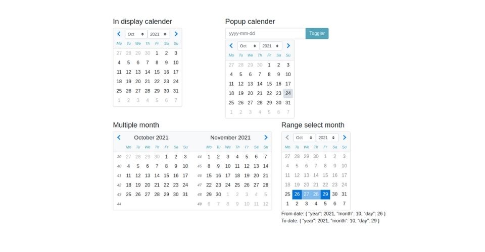
<h4 class="mb-2">In display calender</h4>
<ngb-datepicker #dp [(ngModel)]="model" (navigate)="date = $event.next"></ngb-datepicker>
</div>
<div class="col-4">
<h4 class="mb-2">Popup calender</h4>
<div class="input-group">
<input class="form-control" placeholder="yyyy-mm-dd"
name="dp" [(ngModel)]="model" ngbDatepicker #d="ngbDatepicker">
<div class="input-group-append">
<button class="btn btn-info" (click)="d.toggle()" type="button">Toggler</button>
</div>
</div>
</div>
</div>
</div>
ngb-datepicker input and outputs attributes
Input Attributes
- minDate: Min date is can be selectable.
- maxDate: maxDate input is the last day can be select. Default 10 past years is selectable.
- startDate: The date to open calendar with.
- displayMonths: The number of months calendar want to display. default value 1.
- dayTemplate: dayTemplate allows to completely override the way a day ‘cell’ in the calendar is displayed. dayTemplate provide a custom template for the day.
- dayTemplateData: The callback to pass any arbitrary data to the template cell. Note: support form 3.3.0 version
- markDisabled: The callback to mark some dates as disabled.
- firstDayOfWeek: The first day of the week. by default value 1.
- navigation: navigation input for customize navigation bar which take limit input types
'select' | 'arrows' | 'none' - outsideDays: With outsideDays can be visible outer month day disable, visible. The types of input
'visible' | 'collapsed' | 'hidden' - showWeekNumbers: showWeekNumbers is boolean field. To hidden and visible weak numbers.
- weekdays: The way weekdays should be displayed. Note: support form 9.1.0 version.
Output attribute methods
- dateSelect: An event raised when the user selects a date using the keyboard or mouse. The event payload is currently selected by NgbDate.
- navigate: An event issued just before navigation occurs and the displayed month changes
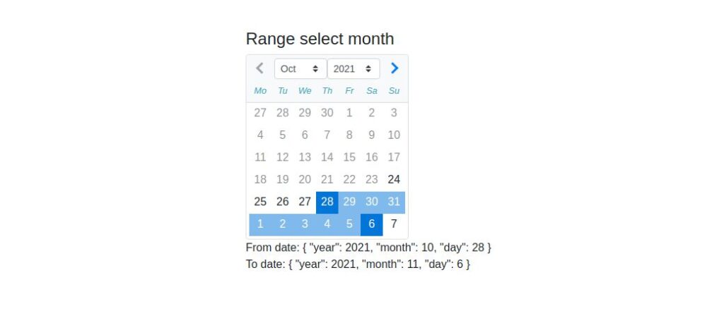
Real use-case range date picker example
Let’s implement the hotel booking period as a range date picker. It will be able to select the next 1 month or 30 days from the current date.
Implement logic update app.component.ts file
import { Component } from '@angular/core';
import { NgbDateStruct, NgbCalendar, NgbDate } from '@ng-bootstrap/ng-bootstrap';

@Component({
  selector: 'app-root',
  templateUrl: './app.component.html',
  styleUrls: ['./app.component.scss']
})
export class AppComponent {

  title = 'ng-bootstrap-datepicker';
  model!: NgbDateStruct;
  date!: { year: number, month: number };
  constructor (private calendar: NgbCalendar) {}
  // Range calender
  hoveredDate: NgbDate | null = null;
  minSelectableDate: NgbDate = this.calendar.getNext(this.calendar.getToday(), 'd');
  maxSelectableDate: NgbDate = this.calendar.getNext(this.calendar.getToday(), 'm');
  fromDate!: NgbDate;
  toDate: NgbDate | null = null;
  onDateSelection(date: NgbDate) {
    if (!this.fromDate && !this.toDate) {
      this.fromDate = date;
    } else if (this.fromDate && !this.toDate && date.after(this.fromDate)) {
      this.toDate = date;
    } else {
      this.toDate = null;
      this.fromDate = date;
    }
  }
  isHovered(date: NgbDate) {
    return this.fromDate && !this.toDate && this.hoveredDate && date.after(this.fromDate) && date.before(this.hoveredDate);
  }

  isInside(date: NgbDate) {
    return this.toDate && date.after(this.fromDate) && date.before(this.toDate);
  }

  isRange(date: NgbDate) {
    return date.equals(this.fromDate) || (this.toDate && date.equals(this.toDate)) || this.isInside(date) || this.isHovered(date);
  }
}
Render range calenar in app.component.ts file
<div class="container py-5">
  <div class="row">
    <!-- ............................... -->
    <div class="col-6 mt-5">
      <h4 class="mb-2">Range select month</h4>
      <ngb-datepicker [minDate]='minSelectableDate' [maxDate]="maxSelectableDate" #dp (dateSelect)="onDateSelection($event)" [displayMonths]="1" [dayTemplate]="t" outsideDays="visible">
      </ngb-datepicker>
      <ng-template #t let-date let-focused="focused">
        <span class="custom-day"
              [class.focused]="focused"
              [class.range]="isRange(date)"
              [class.faded]="isHovered(date) || isInside(date)"
              (mouseenter)="hoveredDate = date"
              (mouseleave)="hoveredDate = null">
              {{ date.day }}
        </span>
      </ng-template>
      <br>
      From date: {{fromDate | json }} <br>
      To date: {{toDate | json }}
    </div>
  </div>
</div>
Styles range calendar to better understanding
.custom-day {
  text-align: center;
  padding: 0.185rem 0.25rem;
  display: inline-block;
  height: 2rem;
  width: 2rem;
}
.custom-day.focused {
  background-color: #e6e6e6;
}
.custom-day.range,
.custom-day:hover {
  background-color: rgb(2, 117, 216);
  color: white;
}
.custom-day.faded {
  background-color: rgba(2, 117, 216, 0.5);
}
::ng-deep {
  .ngb-dp-day.disabled {
    opacity: 0.5;
  }
}
Preview range date picker calendar
Checkout ng-angular documentation: https://ng-bootstrap.github.io